
Closer to Home

This is the color comp for the latest Mercedes Lackey Valdemar novel. For this book I was given a synopsis by the author; she is in the process of writing the book. Our hero, Mags, the former mine slave, has finally graduated from his trainee grays to his Herald whites. He is the first Herald-Spy, so we've returned to the city of Haven, and obviously he won't have his Companion Dallen, his blue eyed spirit/horse, close by when he's spying on people. For that reason I decided it would be a change of pace to not have them in the same physical space. Mags is a mind speaker, so he is constantly in touch with Dallen.

First of all I started with just little idea scribbles in my sketch book. Then I moved onto drawings for the color comp.

Here is my pencil sketch for Mags. I wanted masks to symbolize the different personas he takes on as a spy. These are drawn in graphite, but I scan them and make them darker.

His Companion Dallen.

And the city of Haven. Below are three of the black and white digital comps I made to show the publishers my ideas of how the cover would look.


They chose the last one, and then I did a tightly finished color comprehensive because their publishing deadlines for the sales catalog were moved up. They needed art faster than I could complete the final finish. I also decided to split the art in two, so the designer could be more flexible on the positioning of the Companion on the front, and then use the full horse on the back cover. These were done in oils after printing the drawing onto paper and at the printed size. The first image in this post was the final comp - minus the lettering - that was used for the sales catalog.


I usually do a final drawing to size, but because the color comp was so finished, I just enlarged them right onto the gessoed illustration boards for the final art. Below are some of photographic reference I shot of my son and some small models I used to figure out the lighting of Mag's faces.


The final art was approximately twice the size it would be printed, done in oils on gessoed illustration board. The publisher didn't want Mag's faces to look like masks, so I added in hair on the final art. One of the characters Mags portrays is supposed to be a deaf mute, another a street tough, and that is reflected in the faces he holds.

My drawing board with the finished art and color comps. I know I should have taken pictures in the process of painting, but I forgot. Honestly, I'm a bit insecure that my art is ever going to turn out well, so I probably did that on purpose.

Mags in "Closer to Home."
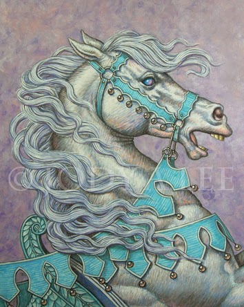
Dallen in "Closer to Home." It was really fun to work on a horse this big. I could make big brush strokes for once. The designer will fade out the darks for the front cover so the type will pop, while on the back he'll probably let the art print like the original. The book comes out from DAW Books in October.
Jody
www.astudiobythesea.com
www.jodylee.org
I Love that middle cover design.
ReplyDeleteAs always, a joy. Can't wait to read the book. Your covers always make the books so tantalizing. Thanks for sharing the process.
ReplyDelete